


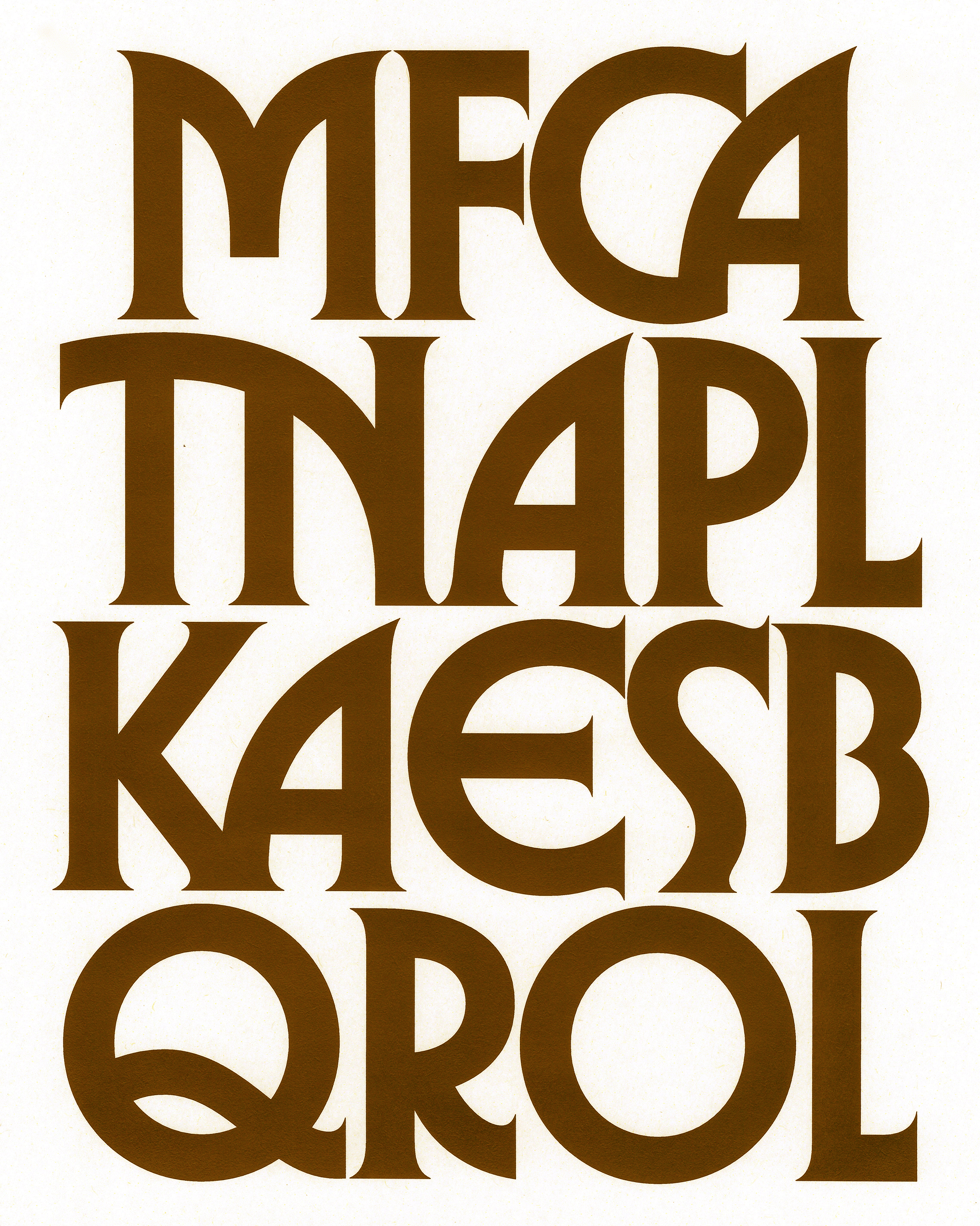
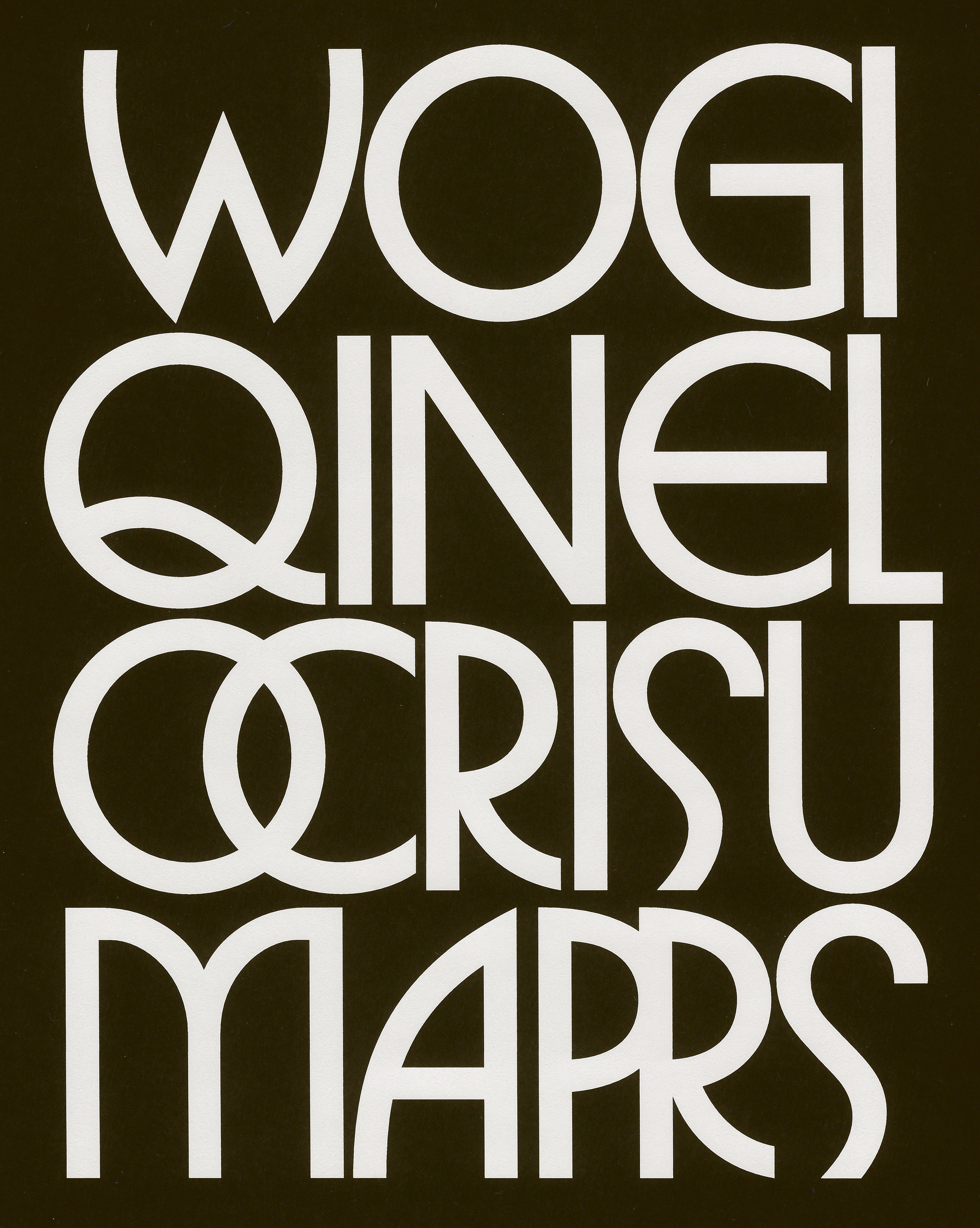
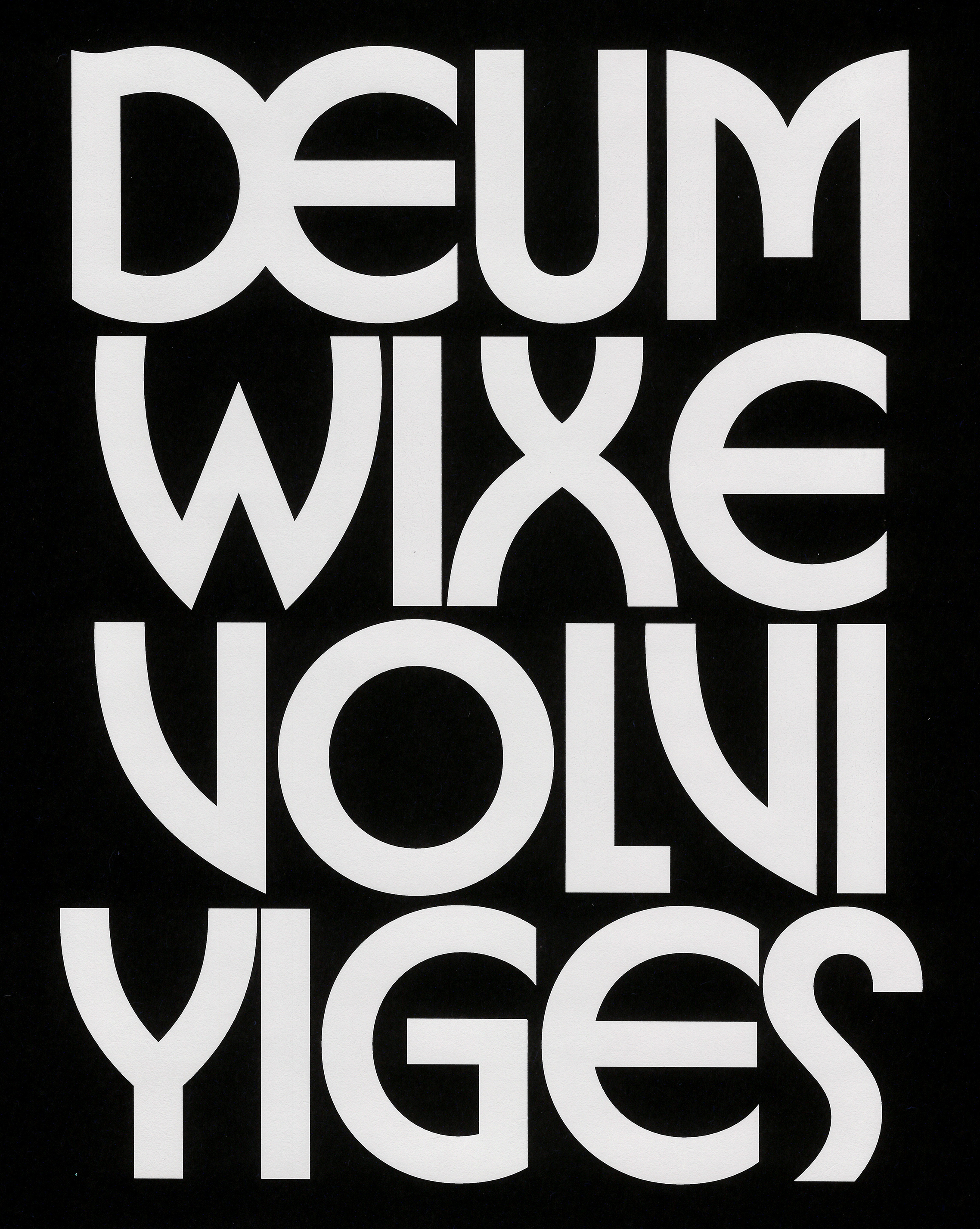
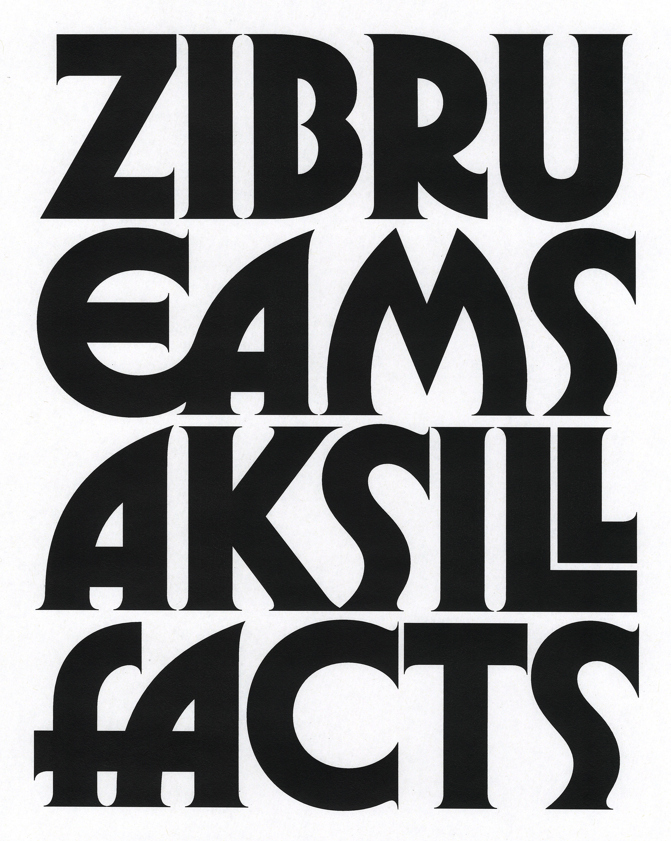


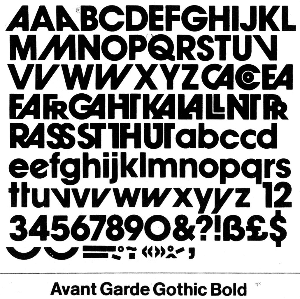
Glyphs Overview
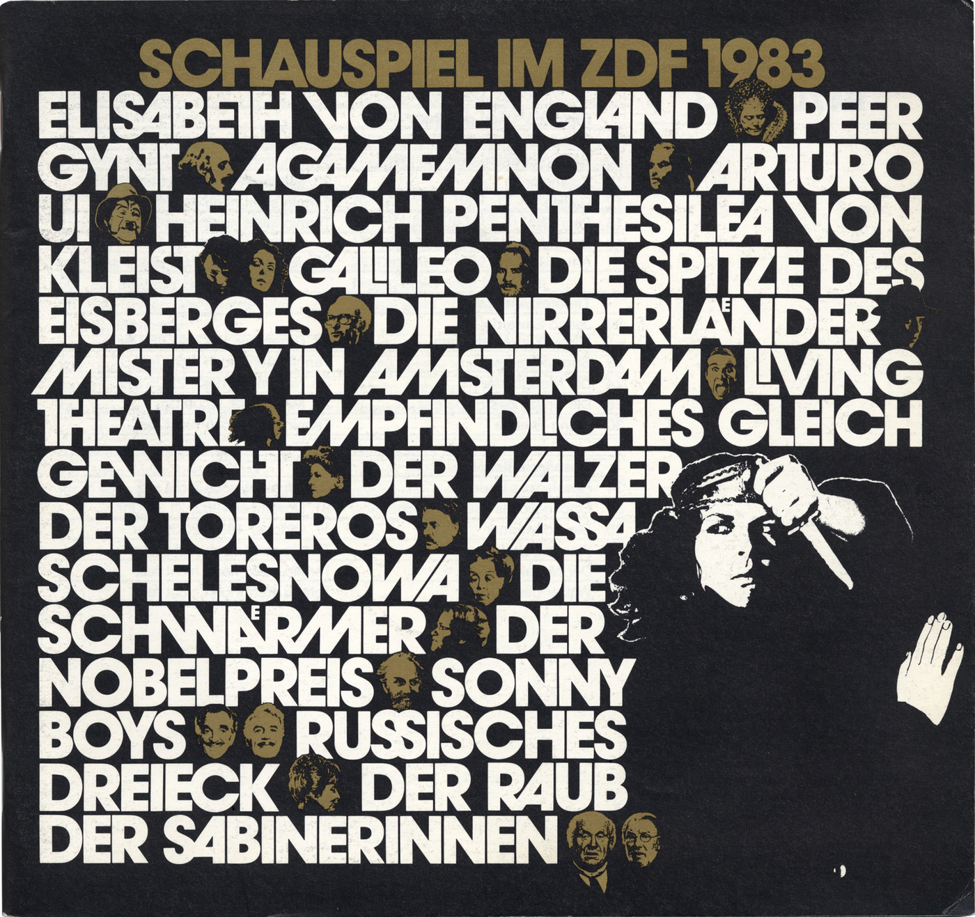
Font in use
Informations
About Herbus
Herbus is a type family available in six styles: Regular, Medium, Bold, and their corresponding serif variants. Its visual identity leaves little doubt about its graphic lineage, while its name — Herbus — offers a more explicit homage to Herb Lubalin, a towering figure in American typographic design during the latter half of the 20th century. The intent is not to claim that this typeface stands alongside Lubalin’s own creations, but rather to acknowledge, with humility, the enduring fascination many of us feel for that period — the 60s through the 80s — and for the forms that emerged from it, often under the influence of Lubalin and collaborators like Tom Carnase, Tony Di Spigna, Ed Benguiat, and others.
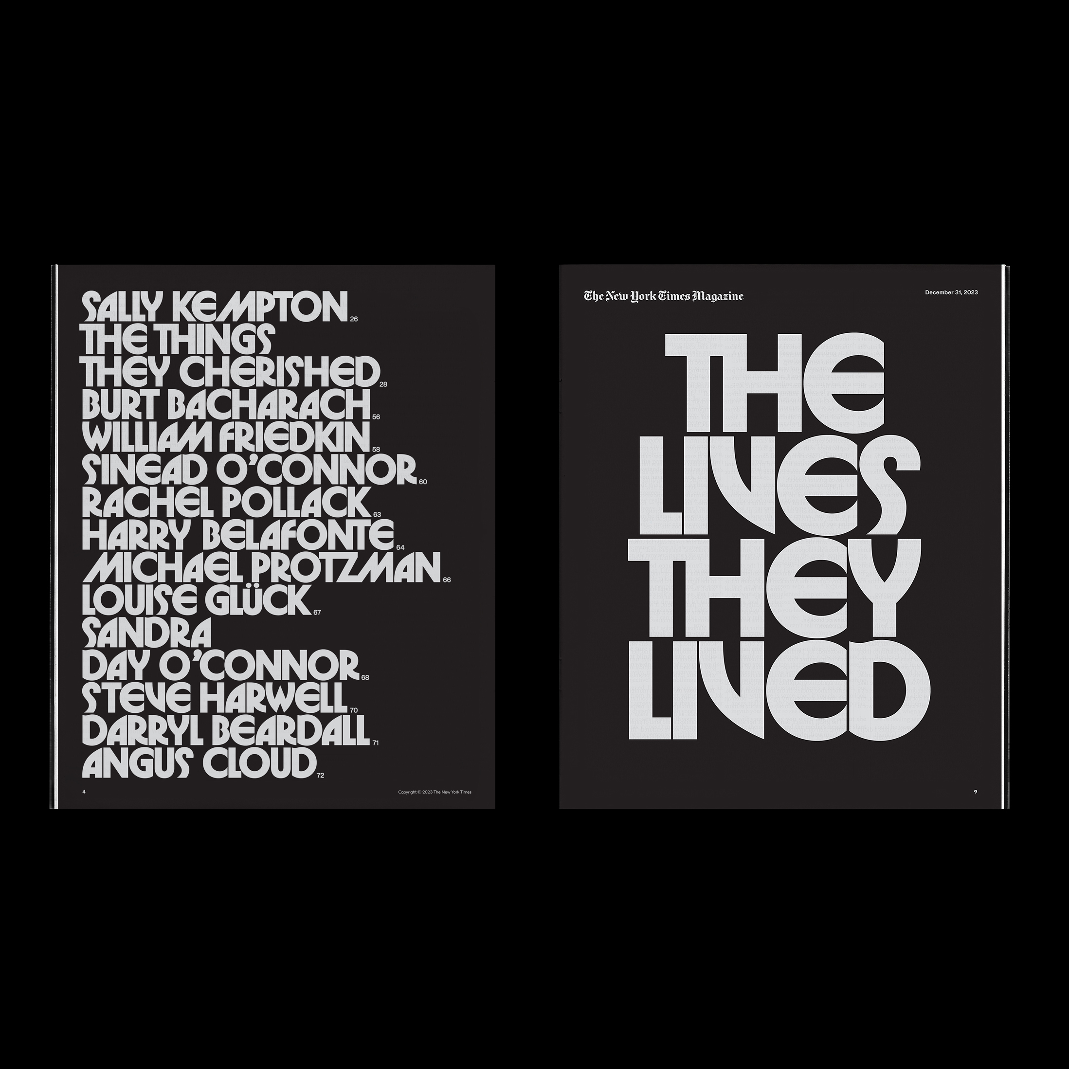
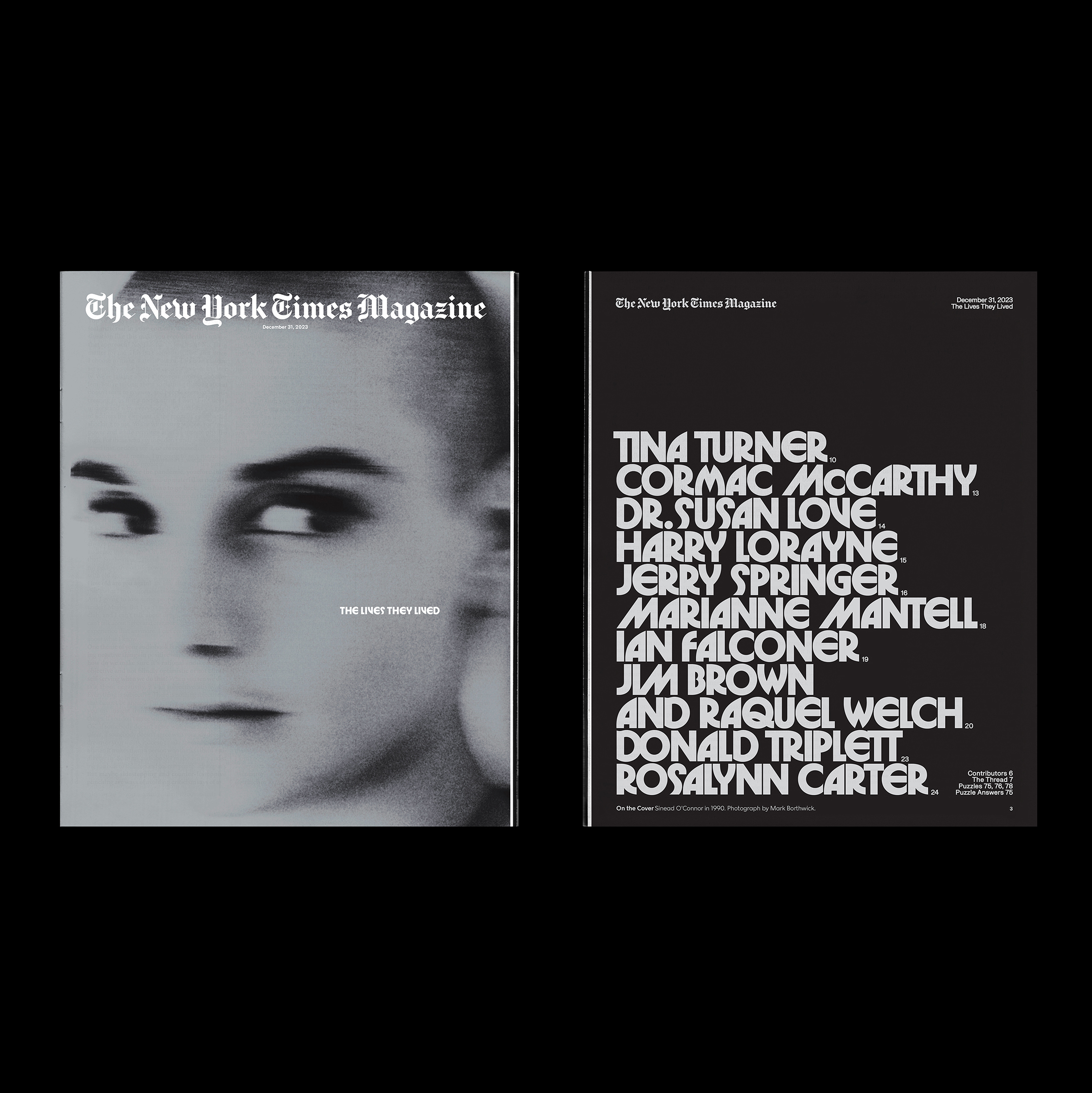
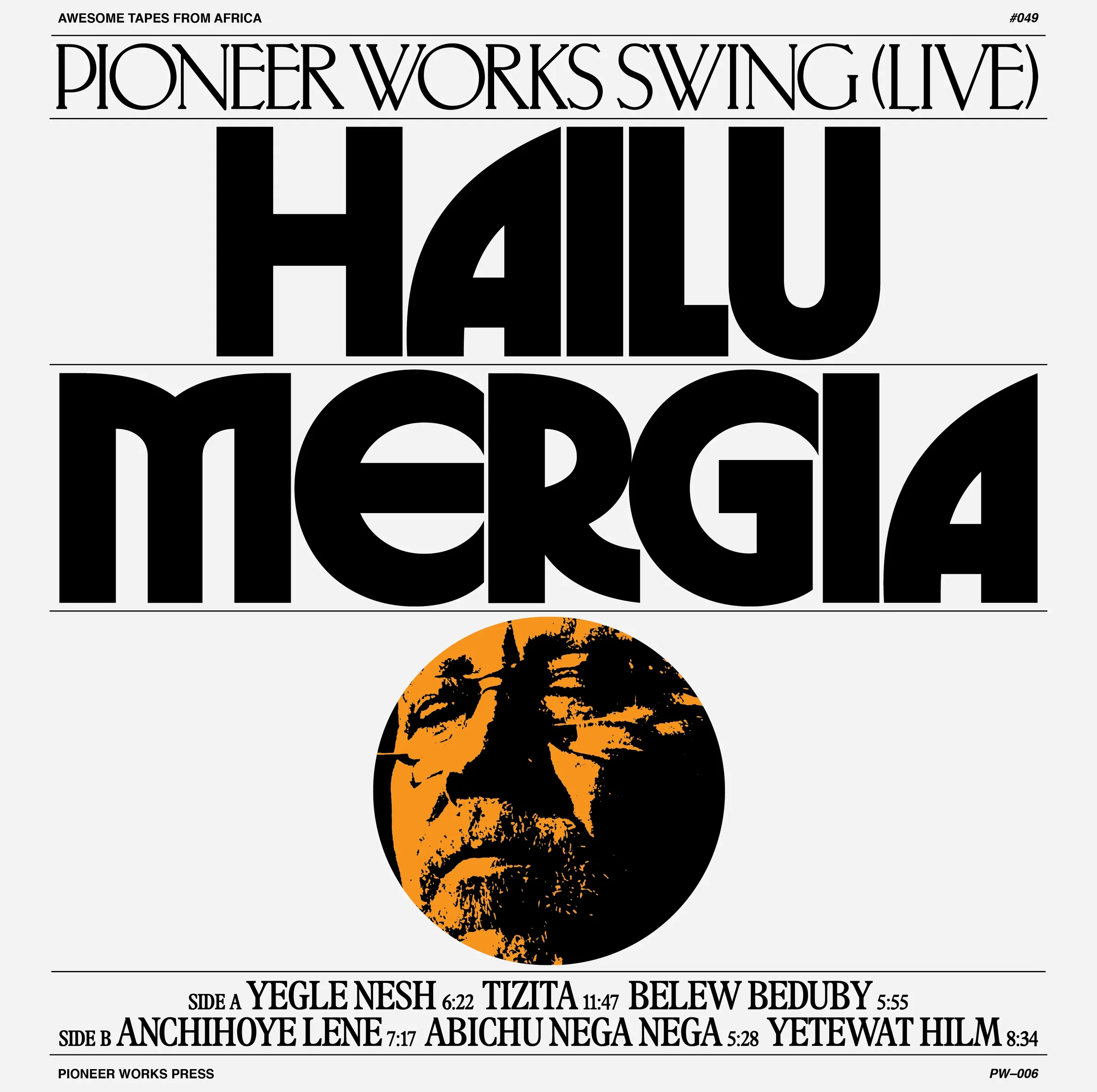
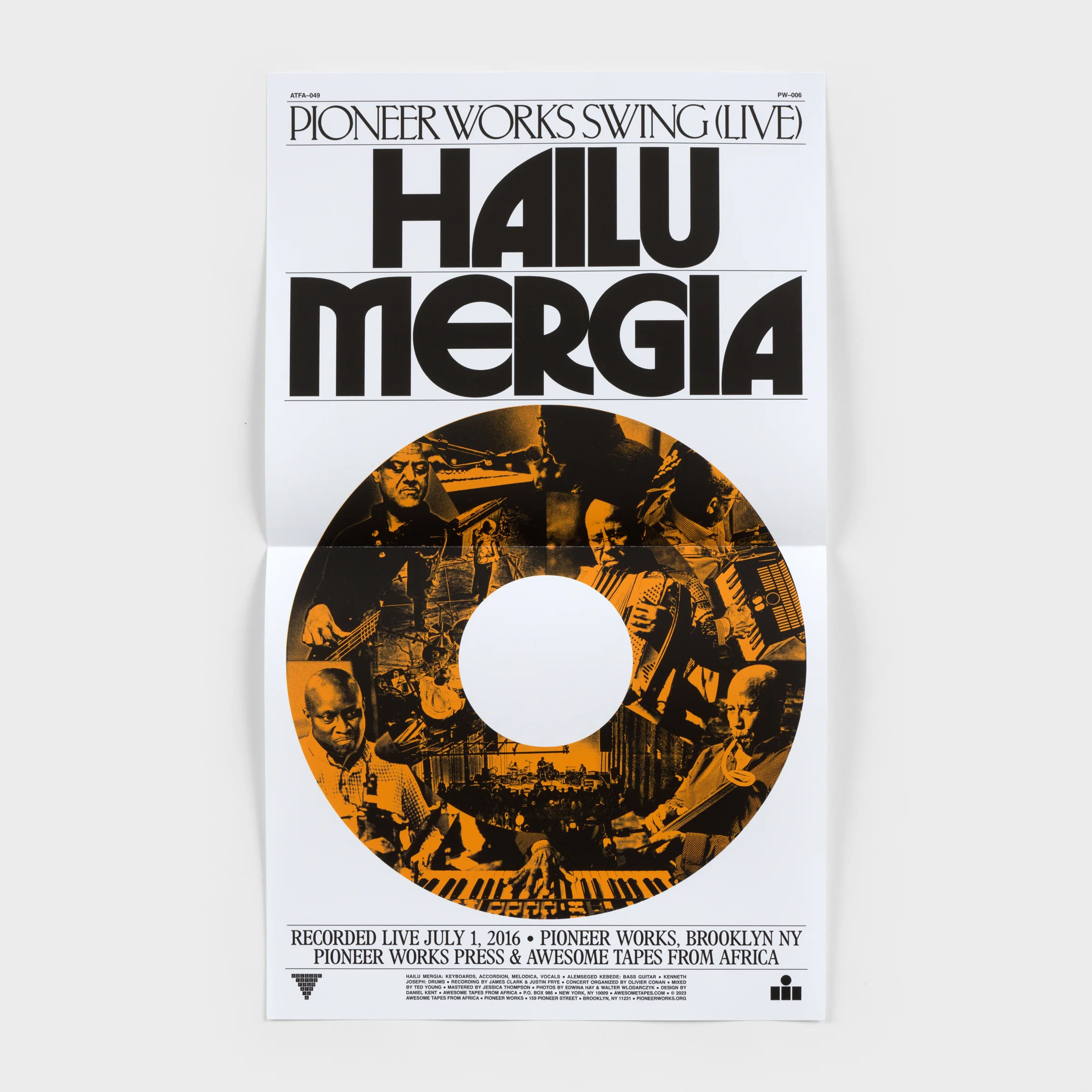
Herbus can be seen as a synthesis of formal elements found in several iconic typefaces of that era, including Avant Garde Gothic, Serif Gothic, and Busorama. These fonts share a taste for expressive geometry and striking silhouettes, often used in advertising, editorial, or branding contexts where typography needed to speak as loudly as the words themselves.
The design of Herbus favors tight spacing and compact leading, drawing inspiration from the dense, image-like compositions typical of mid-century American graphic design. Used in this way, the typeface quickly transforms words into powerful visual forms — not just carriers of language, but graphical elements in their own right. To support this, Herbus includes a set of ligatures and alternate characters, not as decorative extras, but as tools to encourage playful and impactful typographic arrangements.
Herbus is the result of both close observation and the sheer enjoyment of working with these historical shapes — a modest attempt to revisit a particularly bold and experimental moment in typographic history. It doesn’t seek to innovate for innovation’s sake, but rather to provide a type system that allows designers to engage with the same visual tensions and ambitions that animated the work of a previous generation, when typography still aspired to be spectacular.
The first version of Herbus, designed by Eliott Grunewald, was released in 2019. An expanded version, including all six current styles, was published in 2025.
Details
Character set: Latin extended
File formats delivered: OTF, TTF, WOFF, WOFF2
Designed by Eliott Grunewald. Development and mastering by Solenn Bordeau at OTT.
Supported Languages
Afrikaans • Albanian • German • English • Asu • Low German • Lower Sorbian • Basque • Bemba • Bena • Bosnian • Cape Verdean • Catalan • Cebuano • Chewa • Chisena • Cornish • Corsican • Mauritian Creole • Croatian • Danish • Jola-Fonyi • Embu • Spanish • Esperanto • Estonian • Faroese • Filipino • Finnish • French • Friulian • West Frisian • Scottish Gaelic • Galician • Welsh • Ganda • Greenlandic • Gusii • Upper Sorbian • Hungarian • Ido • Indonesian • Interlingua • Interlingue • Irish • Isangu • Icelandic • Italian • Javanese • Jju • Kalenjin • Kamba • Kiga • Kikuyu • Kinyarwanda • Kölsch • Kurdish • Latvian • Ligurian • Lithuanian • Lojban • Lombard • Luo • Luxembourgish • Luyia • Makonde • Makua • Malay • Malagasy • Maltese • Manx • Maori • Matchame • Meru • Northern Ndebele • Southern Ndebele • Dutch • Norwegian Bokmål • Norwegian Nynorsk • Nyankole • Occitan • Oromo • Polish • Portuguese • Rejang • Romansh • Rombo • Romanian • Rundi • Rwa • Samburu • Inari Sami • Northern Sami • Sango • Sardinian • Shambala • Shona • Silesian • Slovak • Slovenian • Soga • Somali • Northern Sotho • Southern Sotho • Sundanese • Swedish • Swiss German • Swahili • Swati • Taita • Taroko • Czech • Teso • Tsonga • Tswana • Turkmen • Vmw • Vunjo • Walloon • Walser • Wolastoqey • Wolof • Xhosa • Zhuang • Zulu